15 techniques
Color and film lookThe palette carries the tone
Color is the tone of a film made visible. A warm amber past, a cold blue present, a desaturated war: audiences read these signals instantly. Consistent color also holds a story together across locations.
A writer sets color through time, place and props, and a director fixes it in a look reference. These pages show each look, what it does to a story and how to describe it so the whole team aims at the same image.

Teal and orange
Teal and orange is a color grade that pushes skin tones and warm lights toward orange and shadows, skies and backgrounds toward cyan blue. Because the two colors sit opposite each other, characters jump forward from the frame and the image feels energetic and big.
Bleach bypass
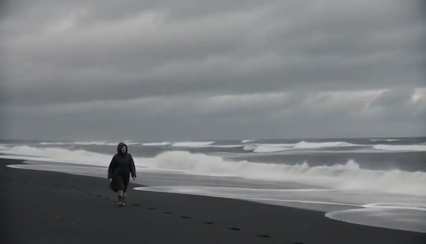
Bleach bypass comes from a film lab process that leaves silver in the image, laying a black and white layer over the color. The result has deep blacks, hard highlights, muted colors and a metallic sheen, and the audience feels harshness, fatigue and danger.

Black and white
Black and white removes color from the image and leaves only tones, from bright white to deep black. The audience looks harder at faces, shapes and light, and often reads the film as memory, history or something timeless.

Sepia
Sepia is a warm brown monochrome, named after the toning used on old photographic prints. The audience instantly reads it as the past, a memory or a story told from far away, gentle and slightly faded.

Desaturated look
A desaturated look lowers the intensity of every color, leaving grays, olives and faded browns while keeping a trace of hue. The audience feels fatigue, loss and a world that has run out of energy.

Hyper-saturated look
A hyper-saturated look pushes colors well beyond their natural intensity, so reds burn, greens glow and neon seems to vibrate. The audience leaves ordinary reality and enters a fable, a party, a high or a satire.
Cool blue grade
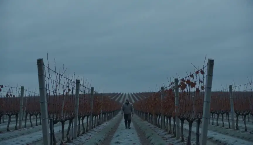
A cool blue grade shifts the whole image toward blue and steel, cooling whites, shadows and often skin. The audience feels cold, distance and control, as if warmth has been removed from the world on purpose.

Warm amber grade
A warm amber grade tilts the image toward gold, honey and orange, warming highlights and giving skin a soft glow. The audience feels closeness, comfort and nostalgia, or the heavy heat of a closed family world.

Faded film look
A faded film look lifts the blacks, lowers the contrast and softens the colors toward pastel, like a print that has sat in the sun for years. The audience reads the image as memory, gentle and slightly out of reach.
Cross processing
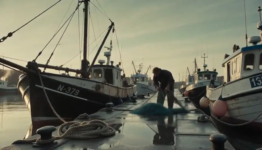
Cross processing means developing a film stock in chemicals meant for another kind of film, which pushes contrast, burns highlights and twists colors toward yellow, green or magenta. The audience feels something raw, chemical and unstable, like a snapshot from a night that went too far.
Day for night
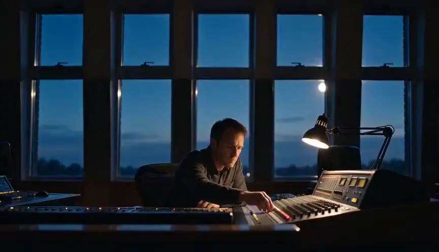
Day for night is the practice of shooting a night scene in daylight, then underexposing and tinting the image blue so it reads as moonlight. The audience sees a vast, detailed night landscape that real darkness would never allow.
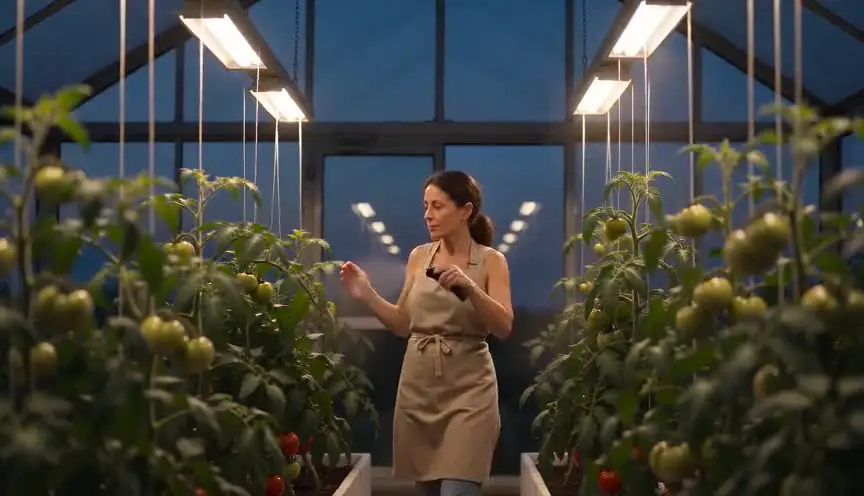
Tungsten balance
Tungsten balance sets the camera to around 3200K, the color of incandescent bulbs, so lamps look neutral and daylight turns strongly blue. The audience sees a frame split between human warmth indoors and a cold world outside the window.
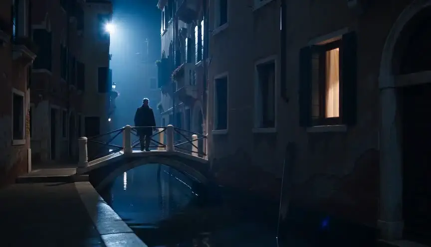
Moonlight gel
A moonlight gel is a blue filter placed on a light, usually from high and behind, to imitate moonlight at night. The audience accepts the blue glow as the moon and can read shapes, faces and fog in a night that still feels dark.

Split toning
Split toning tints the shadows with one color and the highlights with another, for example green or teal in the dark areas and amber on the skin. The audience feels a double mood in the image: warmth and menace, comfort and unease, living side by side.

Overexposed look
An overexposed look lets the brightest parts of the image burn to pure white, so skies, windows and skin glow and lose detail. The audience feels heat, memory, grace or a world beyond the ordinary, as if light itself were taking over.