Split toningTwo colors, two moods in one frame
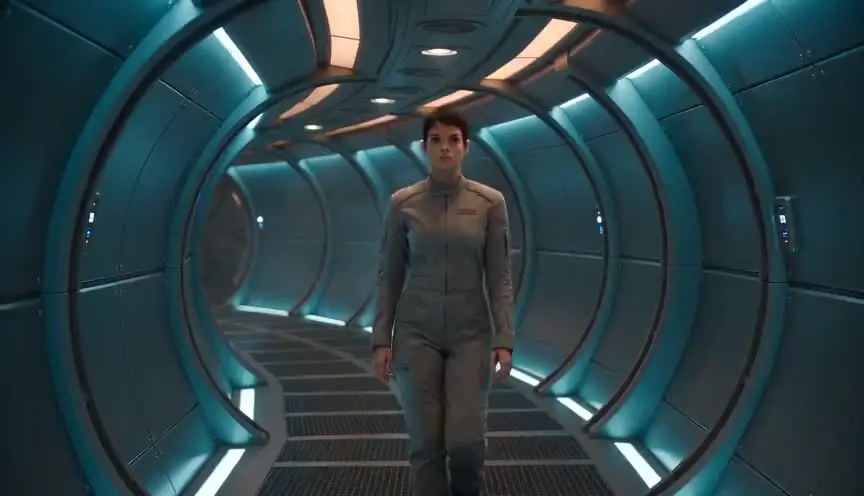
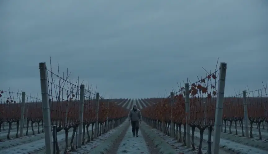
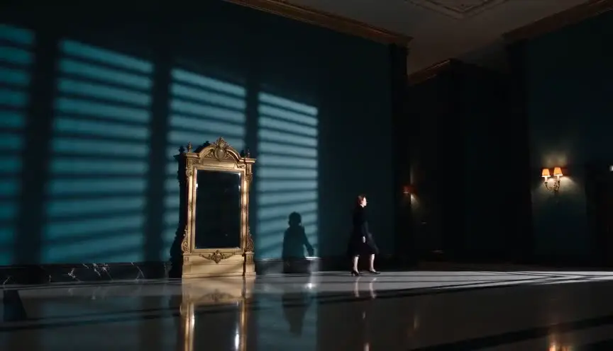
Split toning tints the shadows with one color and the highlights with another, for example green or teal in the dark areas and amber on the skin. The audience feels a double mood in the image: warmth and menace, comfort and unease, living side by side.
Also calledSplit tone gradeDual-tone color gradingShadow/highlight tinting
Color and film look
Why it works on screen
Split toning gives a scene an emotional undertone that the audience senses without naming. Warm highlights keep faces alive and inviting. Cool or strange shadows suggest what lies beneath: danger, loneliness, a secret, a world that is not quite right. It serves thrillers, whimsical fables, noir, romance with a shadow over it and any story built on duality. A film earns it when the tension between surface and depth matters, when characters smile in the light while something waits in the dark. Because it works through tone rather than through a single color, it can be subtle enough to shape an entire film.
The shot list line
- Size
- Medium shot
- Angle
- Eye level
- Movement
- Static or a slow lateral track
- Lens
- 40mm to 50mm
- Duration
- 5 to 10 s
Light the faces with a warm key and let the shadows fall into a cooler ambient, so the colorist can separate the two tones cleanly without pushing skin.
Screenplay
On the page
Split toning is a grading choice and never appears in a spec script. The writer supplies the contrast it builds on: warm lamps or sunset on faces, dark corners, cold streets, deep water. Describe where the light is and where the dark is, especially when a scene has a double mood. That is the material the cinematographer and colorist work with. The two tones and their balance are set in the look book and the grading notes.
EXT. SEAWALL - HAVANA - DUSK
The last sun on the faces of fishermen and couples. Below the wall, the sea already black and restless.
OSVALDO (60s, straw hat, a trumpet case at his feet) plays a slow bolero for no one in particular.
A young woman, YARA (20s), sits a few meters away, listening, a sealed envelope in her lap.
A wave hits the wall. Spray rises between them.
YARA
My mother said you would be here. She said you always are.
Storyboard
In the storyboard
Color the panel in two layers: shade all shadows and dark areas with a single cool color, such as teal, green or blue, and color all bright areas, including skin, with a warm color such as amber or gold. Keep the midtones as neutral as possible. Under the panel, note the two tones chosen, their balance and the emotional reason, for example warm faces against a threatening sea.
Pairs well with
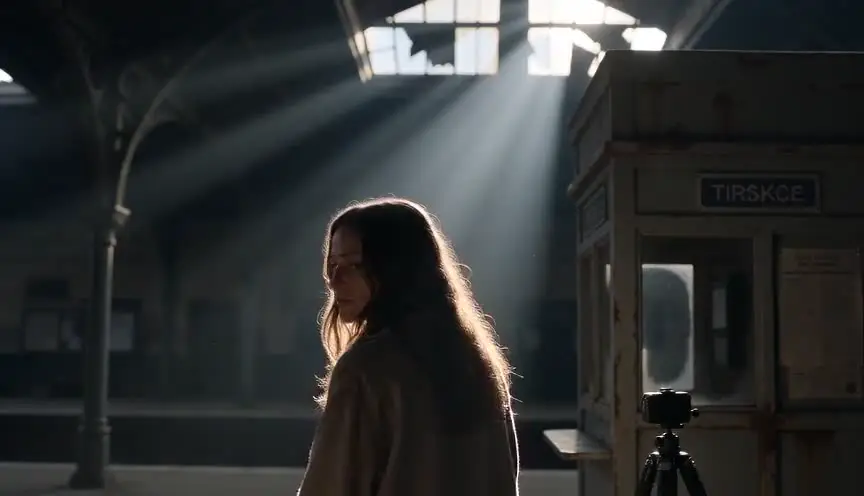
A warm key on the faces gives the split its warm half. Once the key is set, the cool fill or ambient provides the other half, so the grade only strengthens what the lighting already built.
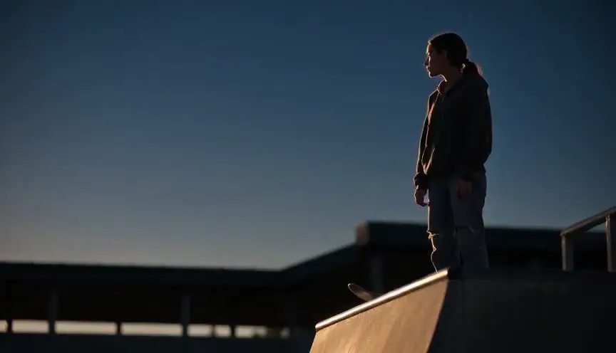
Low-key lighting leaves large dark areas, which gives the shadow tone room to exist. The more shadow in the frame, the more the cool tint carries the scene's undercurrent.
Reference
Watch it in
Amélie (2001)
Bruno Delbonnel pushed green into the dark areas while keeping the skin and highlights a warm amber, a split that many colorists still study.
Skyfall (2012)
Roger Deakins sets cool teal shadows against warm highlights from practical lights, a separation that recurs through the film and in many analyses of it.
ScreenWeaver
Set it up in ScreenWeaver
Describe the warm light and the dark areas of each scene in your action lines, and ScreenWeaver breaks the screenplay down into shots automatically. Open each shot, set the framing, angle, movement and duration, and add a split toning note with the shadow color and the highlight color. Characters and locations carry from shot to shot, so the tones stay consistent across a sequence, and the AI previsualization lets you judge the balance.
Start writing for freeThe prompt behind this clip
This is the exact prompt that rendered the clip at the top of the page. Keep the description of the camera and the light, change the subject and the place.
Split toning color grade, static camera on a tripod, 50mm lens, slow push in over four seconds inside a ballet rehearsal room with mirrored walls and a wooden floor. Two dancers stretch near a tall window. Warm amber light falls across their skin and the highlights of the floor, while the corners of the room and the shadows under the barre stay cool teal blue. Midtones remain neutral gray. The color separation stays constant and consistent through the whole shot, no color shift, no camera shake. No text.
Common mistakes
- 01
Tinted skin
If the shadow color creeps into the midtones, faces turn green or blue. Keep the split in the extremes and protect skin in the grade.
- 02
Colors that clash
Two random tones can look like a mistake. Pick complementary or harmonious pairs, such as teal and amber or green and gold, and test them on real footage.
- 03
Too strong from the start
A heavy split in the first scene leaves nowhere to go. Start subtle and increase the separation as the story's duality grows.