Hyper-saturated lookColor louder than real life
A hyper-saturated look pushes colors well beyond their natural intensity, so reds burn, greens glow and neon seems to vibrate. The audience leaves ordinary reality and enters a fable, a party, a high or a satire.
Also calledHypersaturationBoosted color gradeVivid grade
Color and film look
Why it works on screen
Saturation sets the emotional volume of a film. Pushed high, it serves whimsy, romance seen through rose glasses, euphoria, intoxication and dreams. It can make a city into a storybook, a party into a trance or a suburb into a candy-colored lie. That last use matters: bright color over a dark story creates irony, and the audience senses something rotten under the gloss. A film earns it when the characters see the world more intensely than normal, whether from joy, drugs, fantasy or denial. The look is a promise that this is not realism, so the story should keep that promise.
The shot list line
- Size
- Wide shot
- Angle
- Eye level
- Movement
- Handheld weaving through the crowd, or a steady dolly
- Lens
- 24mm to 35mm
- Duration
- 3 to 6 s
Build saturated color in costumes, set and practical lights first, then push it in the grade, and keep an eye on skin so faces do not turn orange or red.
Screenplay
On the page
A spec script does not name the grade, but it can put color at the center of the world. Describe the red of a door, the green of a coat, the pink of a sky, the fluorescent glow of a club. Use color words where they matter to the character's perception, not in every line. If the whole film lives in heightened color, a short note in the first scene's description can set the tone. The grade itself goes in the look book.
EXT. COURTYARD - LAGOS - NIGHT
A wedding party at full volume. Two hundred guests in matching fuchsia and gold, string lights in every tree, a live band sweating under a green canopy.
TEMITOPE ADEYEMI (60s, gele as tall as a crown) dances through the crowd with a fan of banknotes.
Her grandson KUNLE (19), in a suit two sizes too big, tries to hide behind the jollof rice.
She finds him instantly.
TEMITOPE
You think you can hide from me in fuchsia? Dance!
Storyboard
In the storyboard
Color the panel with the most vivid markers you have, choosing two or three dominant hues and repeating them across the frame. Keep skin tones warm but recognizable. Mark practical light sources such as string lights or neon with small glowing halos. Under the panel, write the dominant colors of the scene and the saturation target, and flag any color that should stand out above the others.
Pairs well with
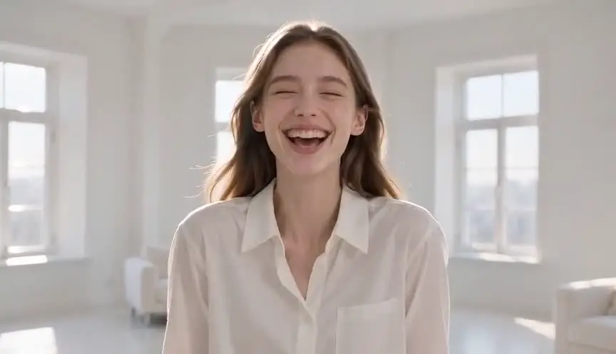
Bright, low-contrast lighting lets saturated colors shine without falling into shadow. Together they build a cheerful, storybook world where nothing is hidden.
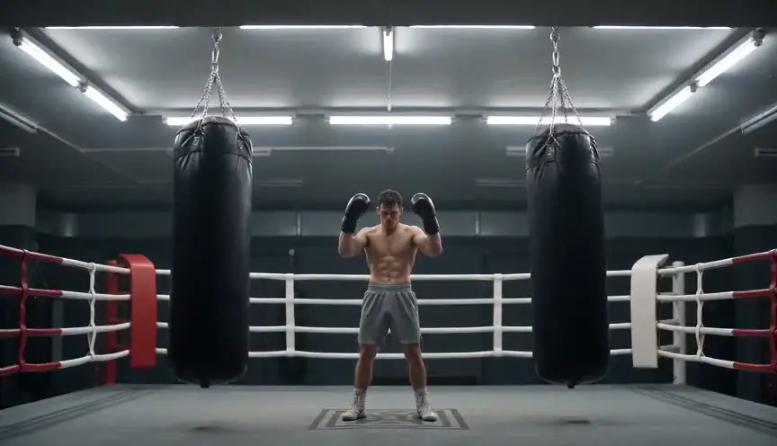
A symmetrical, composed frame gives intense color a clear structure. The combination turns scenes into tableaux that feel designed, playful and slightly unreal.
Reference
Watch it in
Amelie (2001)
Reds and greens are pushed well past nature, turning Paris into a whimsical storybook city shaped around the heroine's imagination.
Enter the Void (2009)
Neon and ultraviolet colors are driven to extremes to render a drug-soaked, out-of-body point of view drifting over Tokyo.
Spring Breakers (2012)
Hot pinks and neon light saturate every scene, building a hypnotic party dream that grows more dangerous as it goes.
ScreenWeaver
Set it up in ScreenWeaver
Write the dominant colors of the world into your action lines, and ScreenWeaver breaks the screenplay down into shots automatically. Open each shot, set the framing, angle, movement and duration, and add a hyper-saturated color note with the key hues. Characters, costumes and locations carry from shot to shot, so the palette stays coherent across the sequence, and the AI previsualization lets you check how loud the color should get.
Start writing for freeThe prompt behind this clip
This is the exact prompt that rendered the clip at the top of the page. Keep the description of the camera and the light, change the subject and the place.
Hyper-saturated look. A candy shop street at noon: bright red, electric pink, lemon yellow and turquoise storefronts, a woman in a vivid orange dress walks by holding a bunch of bright balloons, every color pushed to the maximum, intense and almost unreal, like a vivid music video. Slow tracking shot. No text.
Common mistakes
- 01
Clipping the colors
Pushed too hard, reds and blues lose all texture and become flat blobs. Watch the vectorscope and keep detail in the most intense colors.
- 02
Every color at maximum
When everything is loud, nothing stands out. Choose a dominant palette and let a few colors lead instead of boosting the whole image.
- 03
Color without a reason
Saturation with no link to the story reads as a filter. Tie it to a point of view, a place, a mood or an irony the audience can feel.