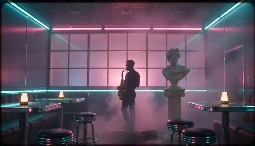
Faded film lookA summer you can almost remember
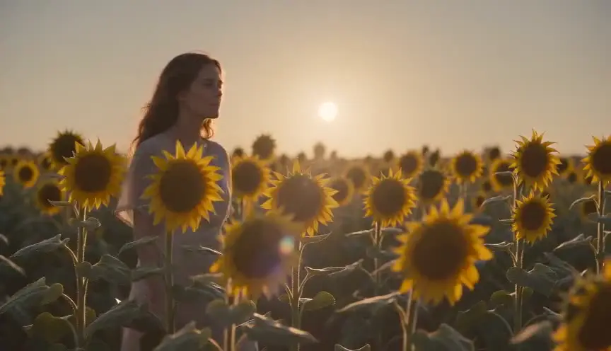
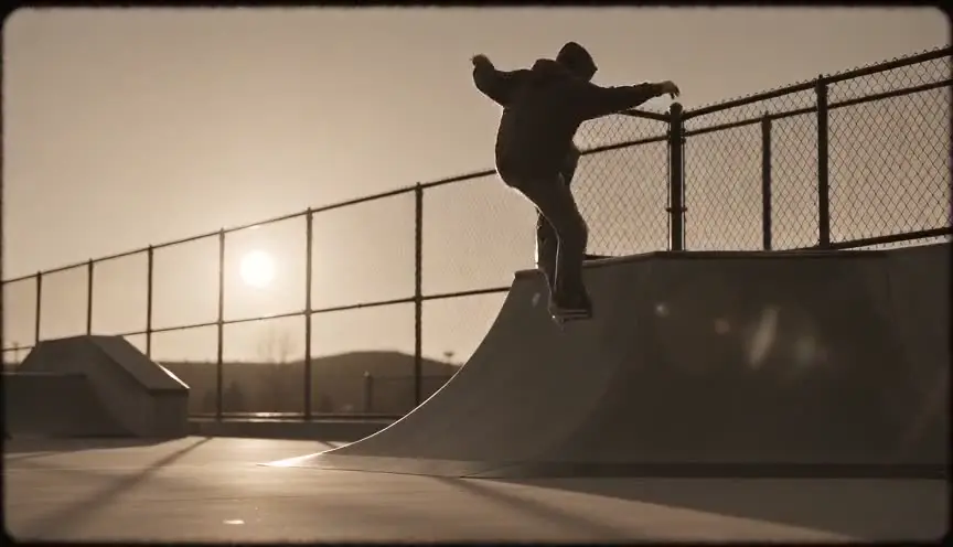
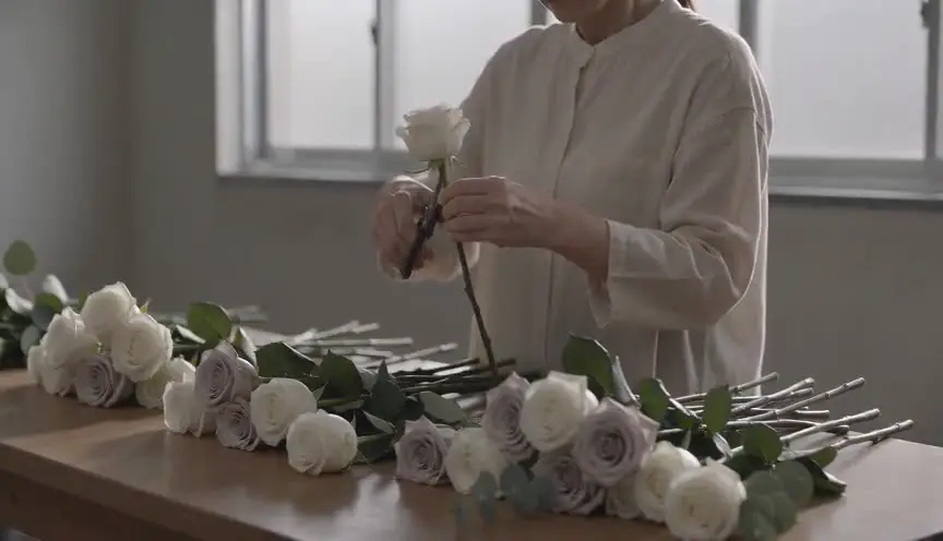
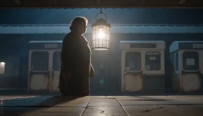
A faded film look lifts the blacks, lowers the contrast and softens the colors toward pastel, like a print that has sat in the sun for years. The audience reads the image as memory, gentle and slightly out of reach.
Also calledWashed-out lookFaded print lookAged film gradeSun-bleached grade
Color and film look
Why it works on screen
Fading is time made visible. It serves stories told in the past tense: adolescence, a lost summer, a family before it broke, a love that did not last. It also gives a western or a period piece a weathered, antique feel, as if the film itself had survived from that era. The emotion is tender and melancholy at once. A film earns it when the narrator is looking back and knows how things ended, or when the story is about how memory softens and distorts. A present-day frame in normal contrast can then show the distance between then and now.
The shot list line
- Size
- Medium shot
- Angle
- Eye level or slightly low
- Movement
- Gentle handheld
- Lens
- 35mm to 50mm, soft or vintage glass
- Duration
- 4 to 8 s
Shoot with soft backlight and a little flare, keep the costumes and set in pastel or sun-bleached colors, and leave room in the grade to lift the blacks without losing the faces.
Screenplay
On the page
The look is a production decision and does not belong in a spec script. What the writer controls is the frame of memory: a narrator in voice over, a year in the scene heading, details that belong to a specific summer, the feeling that the scene is being recalled. Those tell the director that the images should feel remembered. If the faded look marks only the past, make the boundaries between past and present clear on the page. The grade goes into the look book.
EXT. LAKE CABIN - DOCK - SUMMER EVENING (1986)
The sun will not set. Mosquitoes, birch trees, a wooden boat knocking against the dock.
AINO (15, sunburnt, braces) and her cousin PEKKA (16) sit with their feet in the water, sharing a bottle of berry soda.
Pekka dares her to jump. She laughs and does not move.
OLDER AINO (V.O.)
It was the last summer we were all there. None of us knew.
Storyboard
In the storyboard
Color the panel with pale, dusty tones: soft yellows, sky blues, faded pinks. Draw the shadows in medium gray instead of black, so nothing in the frame reaches full darkness. Add a hint of haze near the light source. Under the panel, note the look, the year of the scene, and whether it is a memory or the present, so the look changes where the story changes time.
Pairs well with
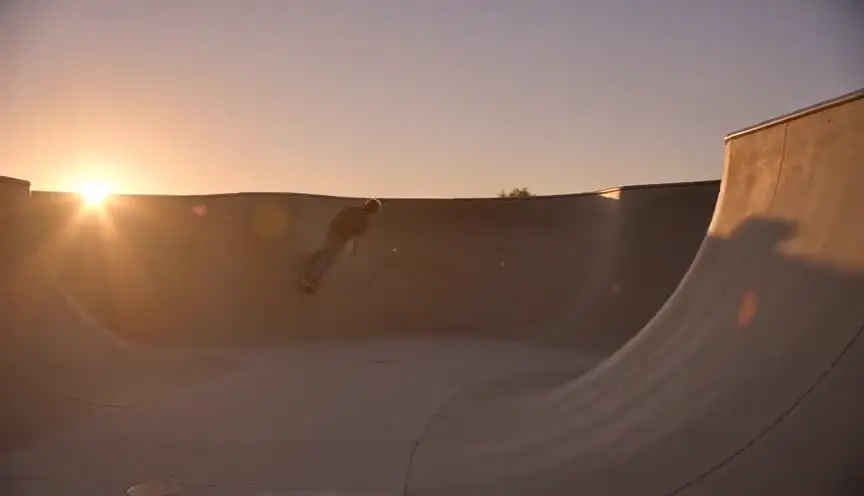
Bursts of orange or red light at the edge of the frame recall old film rolls and home movies. With the faded grade, they make the memory feel handled, fragile and personal.
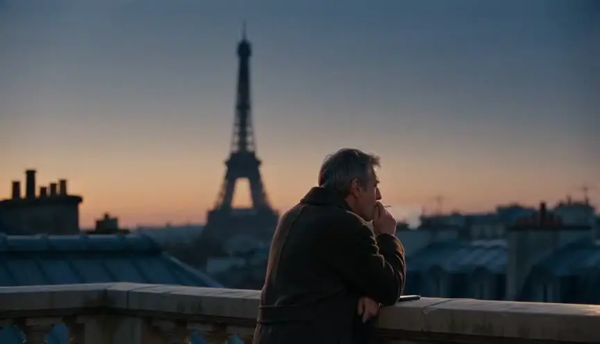
Grain gives the lifted, soft image a physical texture, so it reads as old film rather than a washed-out digital picture. The two together complete the aged print.
Reference
Watch it in
The Virgin Suicides (1999)
Sofia Coppola keeps a soft, warm pastel fade across the film, so the suburban story always feels remembered rather than lived in the present.
McCabe & Mrs. Miller (1971)
Vilmos Zsigmond flashed the negative before shooting, lowering contrast and muting color to give the frontier town an antique, distant quality.
O Brother, Where Art Thou? (2000)
Roger Deakins and the Coens used digital timing to strip out the greens, leaving a dusty, sepia-leaning image that recalls aged photographs.
ScreenWeaver
Set it up in ScreenWeaver
Mark the remembered scenes in your screenplay with a year, a voice over or a clear transition, and ScreenWeaver breaks it down into shots automatically. Open each shot of the memory, set the framing, angle, movement and duration, and add a faded film color note. Characters and locations carry from shot to shot, so the younger and older versions of a place stay linked, and the AI previsualization lets you compare the past with the present.
Start writing for freeThe prompt behind this clip
This is the exact prompt that rendered the clip at the top of the page. Keep the description of the camera and the light, change the subject and the place.
Faded film look: a slow push in on two adults, a woman and a man in their thirties, playing a glowing pinball machine inside a dim neon arcade lined with cabinets. The neon signs and cabinet lights still glow in saturated pink and cyan, but the overall image sits on lifted, milky blacks so shadows read pale gray instead of true black, contrast flattened, colors muted with an uneven warm yellow-pink cast creeping across the highlights. Fine grain drifts across the frame, corners soften into a gentle vignette. Camera and subjects move at normal speed, only the color and contrast carry the aged, sun-bleached film quality. No text.
Common mistakes
- 01
Muddy instead of faded
Lifting blacks too far with no highlight control just looks like a bad exposure. Keep some bright points so the image still breathes.
- 02
Modern color in costumes
Neon synthetic colors fight the pastel palette and date the scene wrongly. Pick costumes and props that fade naturally.
- 03
Fading the present too
If past and present share the same look, the audience cannot tell memory from reality. Keep the fade for the remembered time.