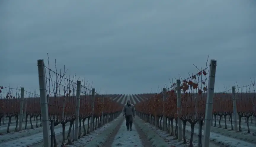
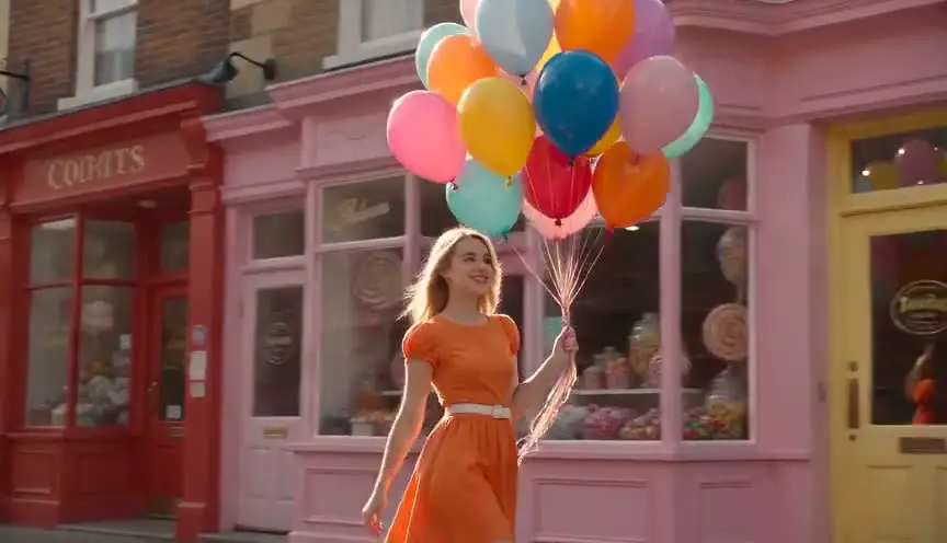
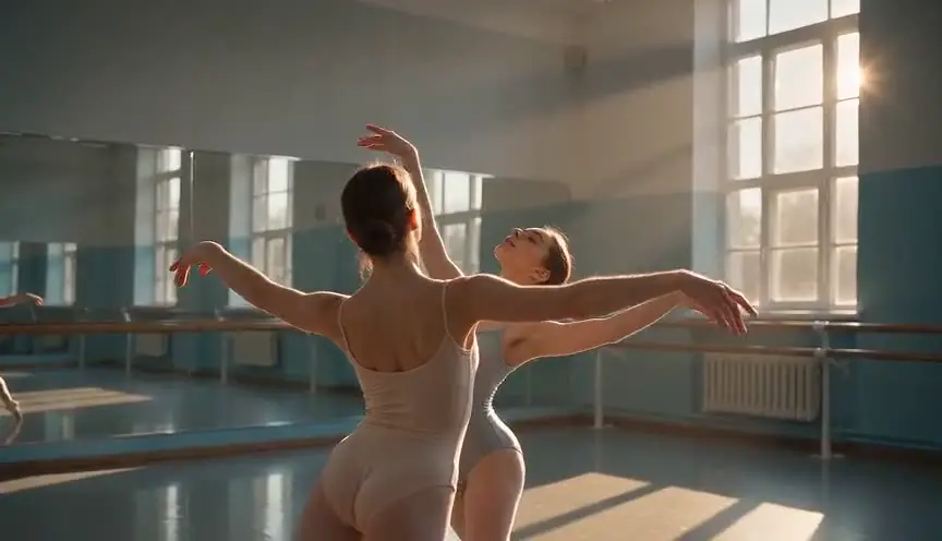
Teal and orangeWarm people in a cold world
Teal and orange is a color grade that pushes skin tones and warm lights toward orange and shadows, skies and backgrounds toward cyan blue. Because the two colors sit opposite each other, characters jump forward from the frame and the image feels energetic and big.
Also calledOrange and tealBlockbuster gradeTeal-orange look
Color and film look
Why it works on screen
The grade separates humans from their environment. Warm faces against cold steel, glass, water or night say that people are alive and the world around them is hard. That contrast serves action, adventure, science fiction, thrillers and any story where a character pushes against a hostile setting. It also gives spectacle a clear read on a big screen or a small phone. A film earns it when its visual world has a strong split, such as fire and ocean, desert and night, city lights and dusk. Used with restraint, it guides the eye. Pushed everywhere, it flattens every mood into the same trailer.
The shot list line
- Size
- Medium shot
- Angle
- Eye level
- Movement
- Slow push in
- Lens
- 35mm to 50mm
- Duration
- 4 to 8 s
Build the split on set with warm practicals or tungsten on faces and cool ambient light in the background, then let the colorist push it rather than create it from nothing.
Screenplay
On the page
A grade is never named in a spec script. What the writer controls are the sources of color in the world: a sodium streetlight, a fire, a sunset, a harbor at dusk, a neon sign against a blue night. Put those in the action lines when they matter to the scene. They give the cinematographer and the colorist something to build on. The grade itself goes into the look book, the lighting plan and notes for the colorist, never into the dialogue or the action.
EXT. CONTAINER PORT - DUSK
Steel boxes stacked six high. The harbor water gone blue-black. One sodium lamp buzzing on a pole.
INGRID VAN DAM (40s, dockworker's jacket, gold tooth) waits under the lamp, her face lit amber.
Headlights. A dark sedan rolls between the containers and stops.
The back window slides down three inches. Nothing else.
INGRID
You are late, and the price just went up.
Storyboard
In the storyboard
Use two colored markers or two digital swatches only: orange for skin, fire and practical lamps, teal for sky, water, walls and shadows. Color the subject warm and everything behind them cool. Note the motivating warm source in the frame with an arrow, and the ambient cool source. Under the panel, write the grade name and the intensity, for instance subtle, medium or strong, so the colorist knows the target.
Pairs well with
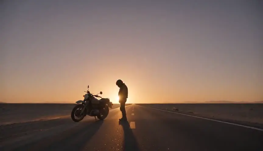
Low sun gives faces natural orange while the sky and shadows turn blue. Shooting in that window builds the teal and orange split in camera, which makes the grade feel motivated instead of applied.
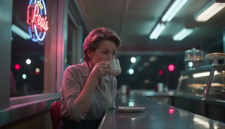
At night, warm skin under an orange practical against cyan neon and wet streets creates the same complementary contrast, which carries the look from day scenes into night scenes.
Reference
Watch it in
Transformers (2007)
Michael Bay tints metal and sky toward cyan while faces and explosions stay warm, and the film is often cited as the one that made this palette mainstream.
Mad Max: Fury Road (2015)
The desert day scenes burn orange with sand and fire, while skies and the night sequences turn cyan, giving the film its much analyzed opposing palette.
ScreenWeaver
Set it up in ScreenWeaver
Put the warm and cool sources of the world into your action lines, and ScreenWeaver breaks the screenplay down into shots automatically. Open each shot, set the framing, angle, movement and duration, and add a color note for teal and orange with the intensity you want. Characters and locations carry from shot to shot, so the palette stays consistent across a sequence, and the AI previsualization lets you check how the faces separate from the background.
Start writing for freeThe prompt behind this clip
This is the exact prompt that rendered the clip at the top of the page. Keep the description of the camera and the light, change the subject and the place.
Teal and orange color grade in a curved space station corridor. A woman in a gray flight suit walks toward camera under warm amber ceiling strips that light her face and hands orange, while the metal walls, floor grating and background haze glow a deep teal from cool ambient panel light. Static wide shot, slight lens distortion, steady frame, four seconds, her warm-lit figure clearly separated from the cold teal environment behind her. No text.
Common mistakes
- 01
Orange skin, teal everything
Pushed too far, faces turn into tangerines and whites go cyan. Keep skin tones believable and protect neutral whites with a qualified correction.
- 02
The same grade on every scene
Applied to comedy, grief and action alike, the grade stops meaning anything. Vary the intensity or drop it when the story changes register.
- 03
No sources on set
A grade built only in post has nothing to hold on to and looks painted. Light warm and cool on set so the colorist enhances real contrast.