Desaturated lookA world with the life drained out
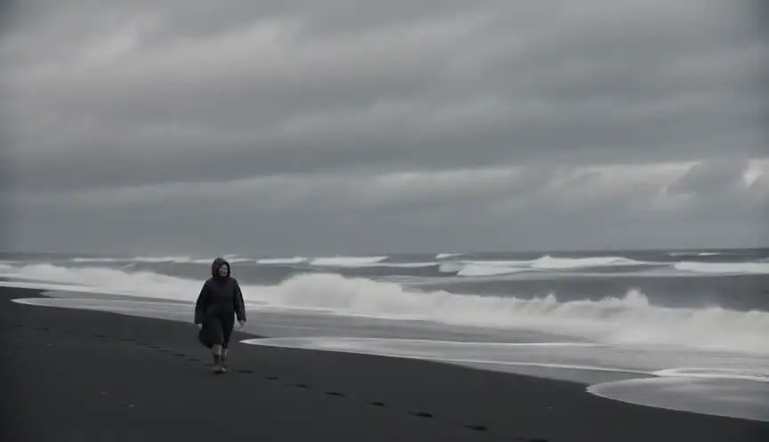
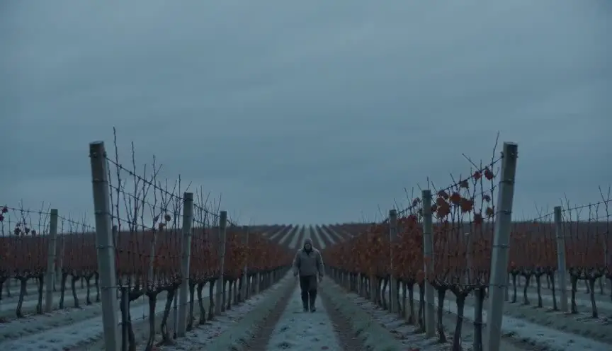
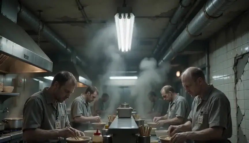
A desaturated look lowers the intensity of every color, leaving grays, olives and faded browns while keeping a trace of hue. The audience feels fatigue, loss and a world that has run out of energy.
Also calledMuted color gradeWashed-out lookLow-saturation gradeDrained color
Color and film look
Why it works on screen
Color is life on screen, so removing most of it tells the audience something has gone wrong. A desaturated palette serves grief, depression, poverty, war, collapse and the long middle of a hard journey. It makes a future feel used up and a present feel stuck. It can also set one thread of a story apart from others, so the audience knows at a glance where it is. A film earns it when hopelessness or exhaustion is the ground the characters walk on. Keep a small reserve of color, a scarf, a flame, a child's toy, and it becomes the one thing the audience clings to.
The shot list line
- Size
- Medium shot
- Angle
- Eye level
- Movement
- Static
- Lens
- 35mm
- Duration
- 5 to 10 s
Build the drained palette in production design and wardrobe first, grays, olives and dusty browns, so the grade only needs to pull saturation down a little and skin stays human.
Screenplay
On the page
The grade itself does not belong in a spec script, but the world that motivates it does. Describe gray skies, cold rooms, worn clothes, dust on everything, a single bright object that stands out. Readers feel the drained world, and the cinematographer recognizes the palette. If one storyline has its own look, you can help by keeping its places and weather consistent on the page. The saturation level and the reference images go in the look book.
INT. SOVIET-ERA APARTMENT - WINTER MORNING
Radiators ticking. Frost on the inside of the window. Wallpaper faded to the color of weak tea.
VYTAUTAS (70s) sits at the kitchen table in a coat, wearing one glove.
His son JONAS (40s) sets down a plate of black bread and a jar of red currant jam, the only color in the room.
Vytautas looks at the jam for a long time.
VYTAUTAS
Your mother made that. The last jar.
Storyboard
In the storyboard
Color the panel with gray markers and only a faint wash of hue on large surfaces. Keep skin slightly warmer than the rest so faces stay alive. If the scene has a single saturated object, color it clearly and circle it with a note. Under the panel, write the target saturation, for example 40 percent, and the scenes or storyline where the look applies.
Pairs well with

Flat, natural daylight from overcast skies and windows supports the drained palette without any styling. Together they make the world feel real, cold and uncared for.
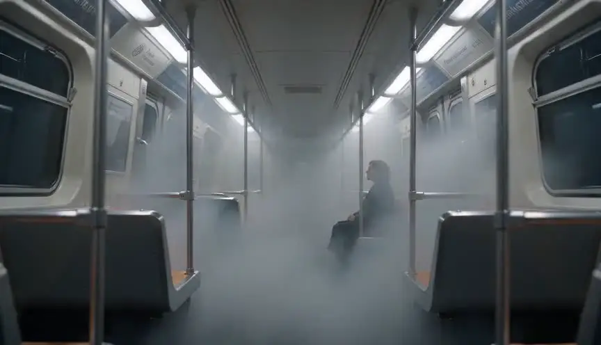
Fog lowers contrast and color even further and hides the distance. A desaturated grade on a foggy exterior gives the sense that the whole world is fading away.
Reference
Watch it in
Children of Men (2006)
The film keeps an almost constant olive and gray palette, so its near-future Britain feels exhausted, dirty and without hope.
The Road (2009)
Nearly every color is removed from the ruined landscapes, leaving flat grays and browns that echo the despair of the father and son's journey.
Traffic (2000)
Soderbergh drains the Ohio storyline into a cold blue gray, so the audience can always tell it apart from the film's other threads.
ScreenWeaver
Set it up in ScreenWeaver
Write the worn, gray world into your action lines, and ScreenWeaver breaks the screenplay down into shots automatically. Open each shot, set the framing, angle, movement and duration, and add a desaturated color note with the target level. Characters, locations and key props carry from shot to shot, so the one colorful object keeps its place, and the AI previsualization lets you judge how drained the scene should feel.
Start writing for freeThe prompt behind this clip
This is the exact prompt that rendered the clip at the top of the page. Keep the description of the camera and the light, change the subject and the place.
Desaturated look: a static locked-off shot inside a small flower shop, framed at eye level on a middle-aged woman arranging white and pale pink roses at a wooden counter. The entire image is drained of color, skin tones a muted beige, the flowers a faint gray-pink, green leaves reduced to pale olive, walls flat gray. Soft, even overcast light comes through a large front window, casting no strong color cast and few shadows. The woman's hands move slowly, trimming stems with scissors, while the camera holds perfectly still for the full four seconds. No text.
Common mistakes
- 01
Gray skin
Pulling saturation globally turns faces sickly. Protect skin tones in the grade unless illness or death is exactly what you mean.
- 02
Relying only on the grade
A bright set desaturated in post looks muddy rather than bleak. Choose muted colors in design and wardrobe so the grade has less work to do.
- 03
No variation
A whole film at the same low level gets monotonous. Let saturation rise slightly for hope and fall further for loss, so color follows the story.