Cool blue gradeCold light, cold feelings
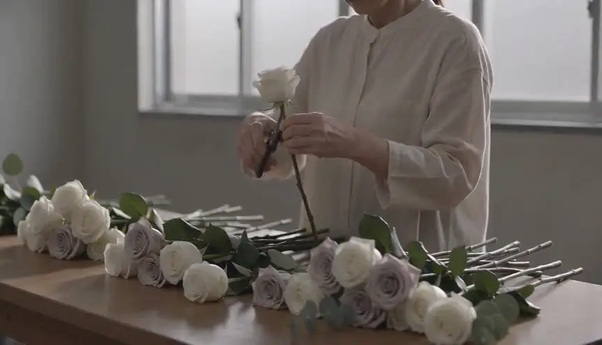
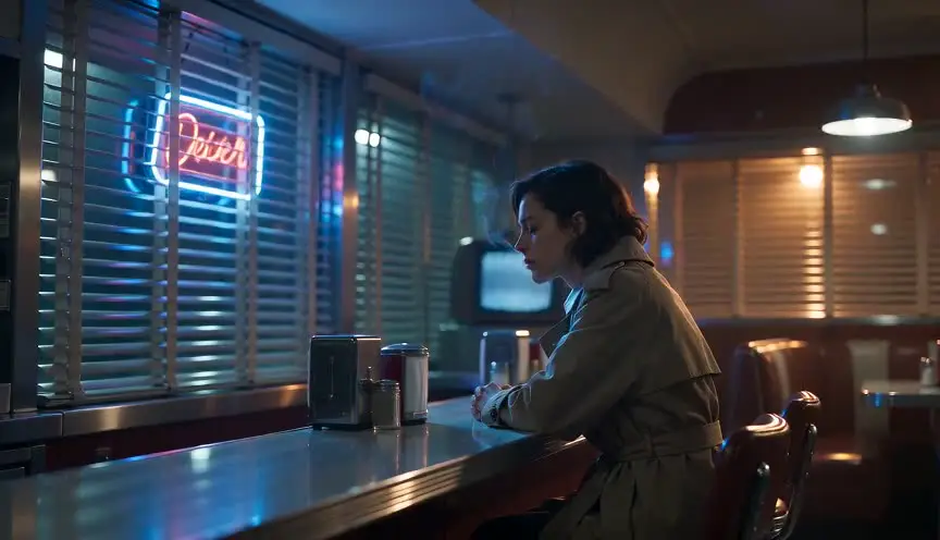
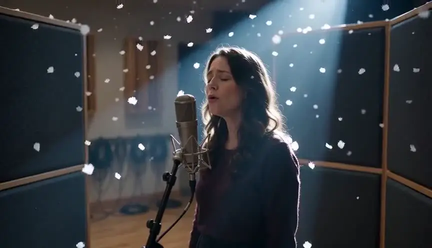
A cool blue grade shifts the whole image toward blue and steel, cooling whites, shadows and often skin. The audience feels cold, distance and control, as if warmth has been removed from the world on purpose.
Also calledCold color gradeBlue washSteel blue look
Color and film look
Why it works on screen
Blue is the color of distance. It makes a hospital feel clinical, a city feel indifferent, a marriage feel frozen. It serves isolation, grief, surveillance, bureaucracy, cold futures and the stillness after a disaster. It also separates one storyline or one world from another, so the audience knows where it is without a title card. A film earns it when emotional temperature is part of the story: a character who cannot reach anyone, an institution that treats people as data, a place where nature is hostile. Warm moments then stand out like a lit window in the snow.
The shot list line
- Size
- Medium shot
- Angle
- Eye level
- Movement
- Static or a very slow lateral slide
- Lens
- 35mm to 50mm
- Duration
- 5 to 10 s
Light with daylight or cool LEDs and keep warm practicals off unless they are story points, so the grade reinforces a cold image instead of fighting a warm one.
Screenplay
On the page
The grade stays out of the spec script, but the cold does not. Describe fluorescent tubes, snow light, steel surfaces, glass walls, breath visible in the air. Show how the characters hold themselves against the cold, physical or emotional. Those details tell the cinematographer what the scene needs. If one storyline or one location always has this look, keep its places and weather consistent in the pages. The exact grade and its references go in the look book.
INT. ARCTIC RESEARCH STATION - LAB - NIGHT (POLAR DAY)
Steel benches, humming freezers, a window full of white glare that never sets.
DR. AKSEL HALVORSEN (50s, fleece, two days of stubble) labels ice core samples in silence.
On a laptop, a video call from home is frozen mid-frame: his daughter, laughing, pixelated.
He reaches to press reconnect, then stops and goes back to his samples.
AKSEL
(into a recorder)
Sample forty-one. Depth, two hundred meters.
Storyboard
In the storyboard
Color the panel with blue and gray tones only, from pale steel in the highlights to deep navy in the shadows. Keep skin slightly less blue than the rest so faces stay readable. If a warm element appears, such as a screen, a lamp or a flame, color it clearly and circle it. Under the panel, note the grade, its strength and the storyline or place it belongs to.
Pairs well with
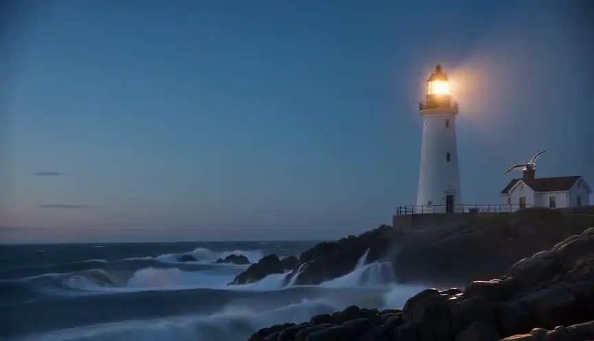
Shooting in the blue light after sunset gives the cool grade a natural base. The sky, the shadows and the city all fall into the same cold register without heavy correction.
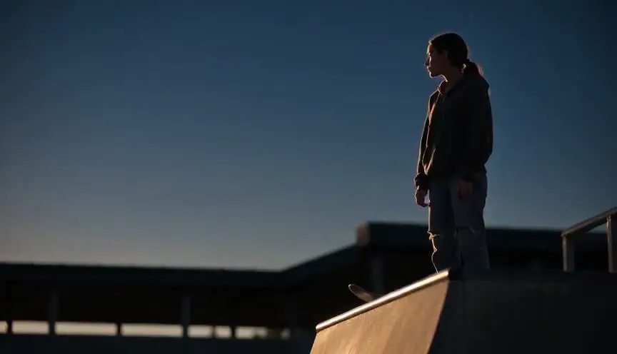
Dark, shadowy lighting with a blue grade gives night scenes a lonely, menacing quality. Together they suit thrillers, grief and scenes of surveillance.
Reference
Watch it in
Traffic (2000)
Soderbergh gives the Ohio thread a hard, almost monochrome blue, a clear contrast with the warm, grainy look of the scenes set in Mexico.
Minority Report (2002)
Spielberg and Janusz Kaminski keep a steel blue, silver-heavy look throughout, so the near future feels clinical and ruled by surveillance.
ScreenWeaver
Set it up in ScreenWeaver
Write the cold into your action lines, the light sources, the steel, the breath in the air, and ScreenWeaver breaks the screenplay down into shots automatically. Open each shot, set the framing, angle, movement and duration, and add a cool blue color note. Characters and locations carry from shot to shot, so the cold place stays recognizable, and the AI previsualization lets you compare it with the warmer scenes around it.
Start writing for freeThe prompt behind this clip
This is the exact prompt that rendered the clip at the top of the page. Keep the description of the camera and the light, change the subject and the place.
Cool blue grade drapes a vineyard in autumn under an overcast sky, the camera holding a static wide shot as a lone worker in a gray jacket walks slowly between rows of bare, rust-colored vines. The color timing pulls all warmth from the leaves and soil, turning them steel gray and cyan, while skin tones stay pale and neutral rather than golden. Contrast is raised, shadows under the vine rows deepen to near black, and the flat daylight reads cold and still for the full four seconds. No text.
Common mistakes
- 01
Blue faces
Pushing skin fully into blue makes characters look dead or ill. Keep a hint of warmth in faces unless that deathly look is the point.
- 02
Mixing warm light by accident
An orange practical in the background of a cold scene fights the grade. Remove or gel it, unless the warm spot is a deliberate story element.
- 03
Same blue for every emotion
Loneliness, fear and calm can all be blue, but not the same blue. Adjust the depth and the saturation of the grade to the feeling of each scene.