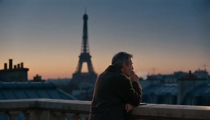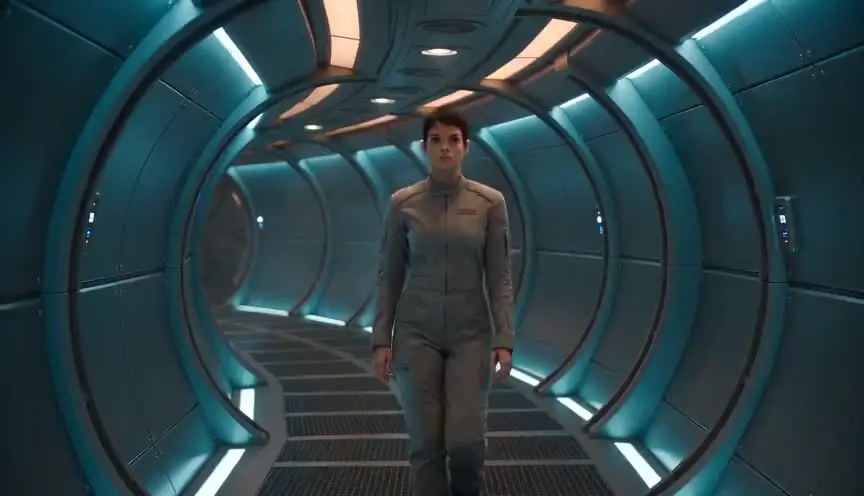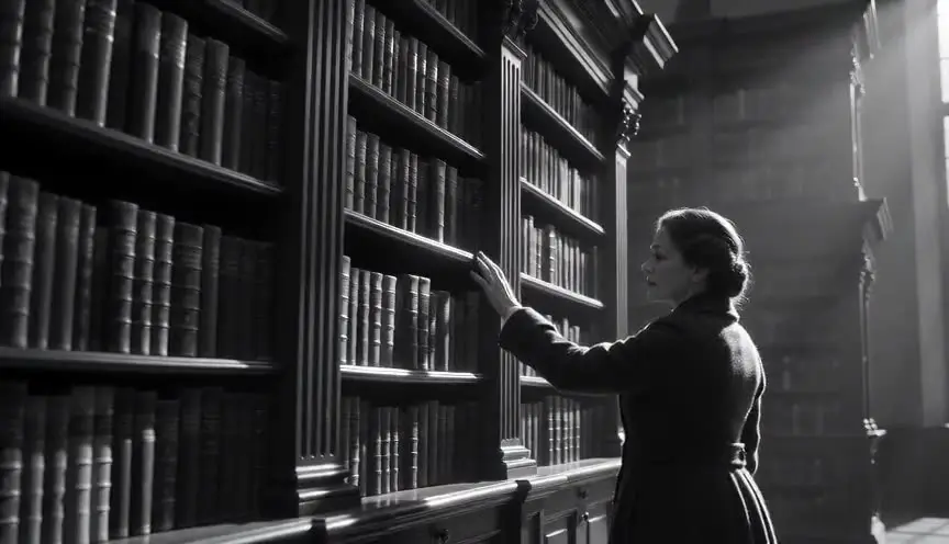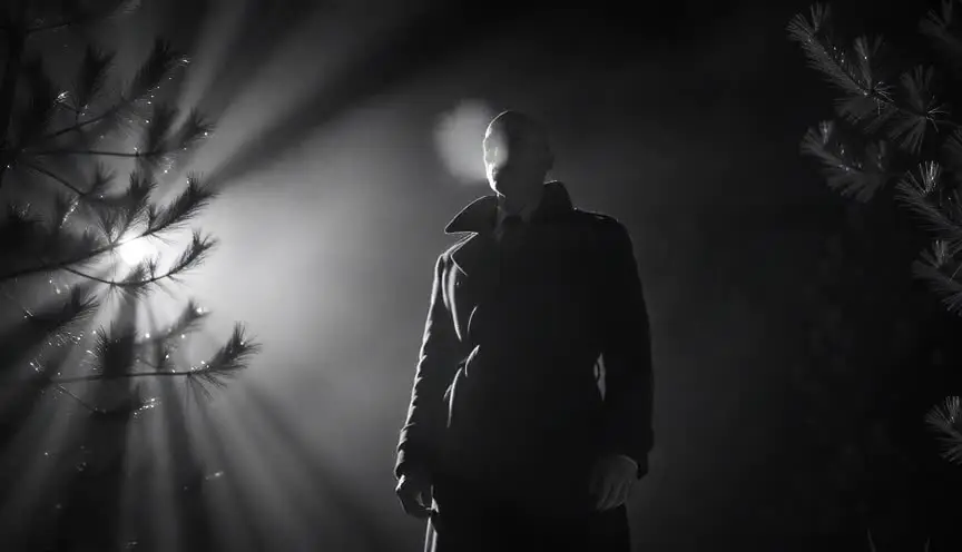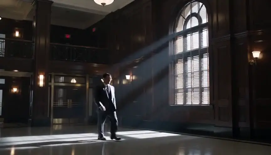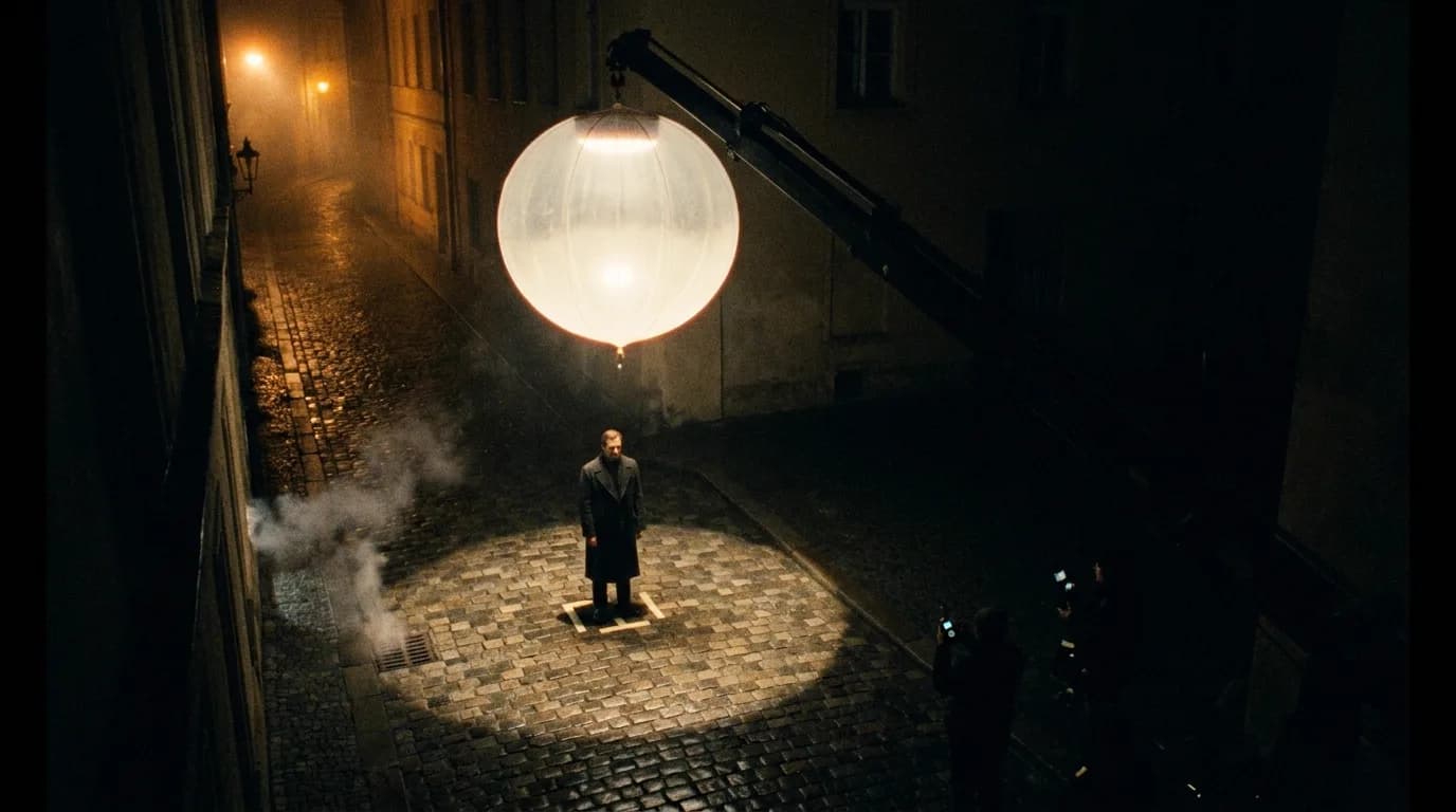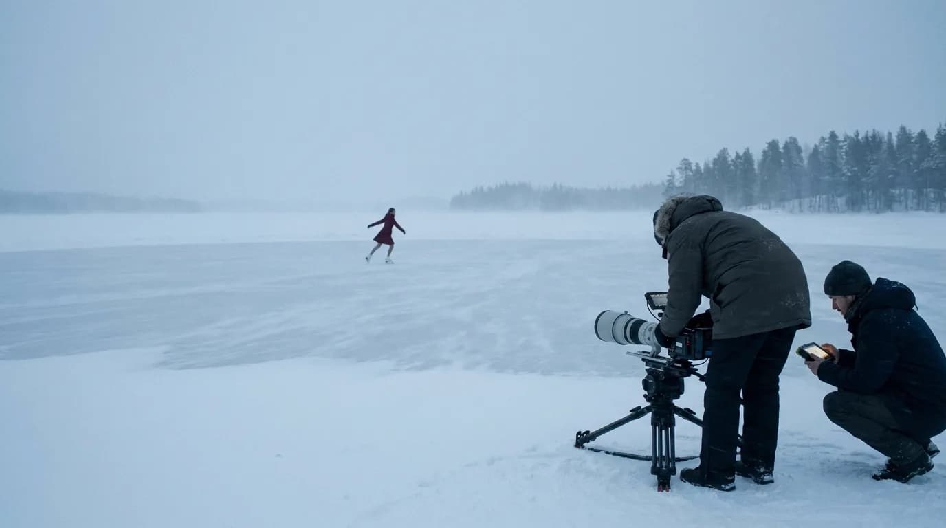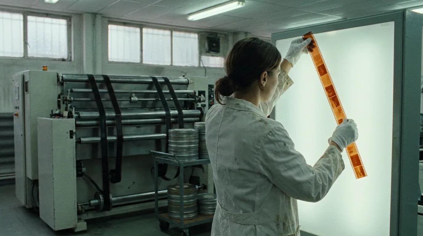

A film look prompt works when it describes what the stock or the grade does to the image: where the color goes, how deep the blacks sit, how much saturation survives and what the grain looks like. "Kodak," "noir" or "teal and orange" on their own are labels. Describe the result, and give the scene light that could produce it.
This page belongs to our director's guide to cinematic prompts. The look usually comes last in a prompt, after the camera, the action and the light, and it only holds if it agrees with that light. The lighting prompts guide covers the part that comes first.
A video model has no film stock
A real film stock is chemistry. It has a speed, a color balance, a grain structure and a way of rolling off highlights. A grade is what a colorist does afterward to push color and contrast. A video model has neither. It has learned what footage described as "shot on Kodak" or "teal and orange grade" tends to look like, and it gives you the average of that.
The average is the problem. "Shot on 35mm film" usually pulls toward warm color and grain, but which warmth and how much grain is the model's guess. "Teal and orange" pulls toward the trailer look, and the trailer look pushes everything to the same two colors.
Google's prompt guide for Veo is a useful reference here, mostly for what it leaves out. Its "Visual style & aesthetics" section lists "cinematic film look" and "shot on 35mm film" as artistic styles, gives "sepia tone, grainy film" as the vintage mood, and lists color palettes such as "muted earthy tones" and "cool blue and silver futuristic palette." It never names a film stock brand, and the words "grade" and "teal" don't appear on the page at all.
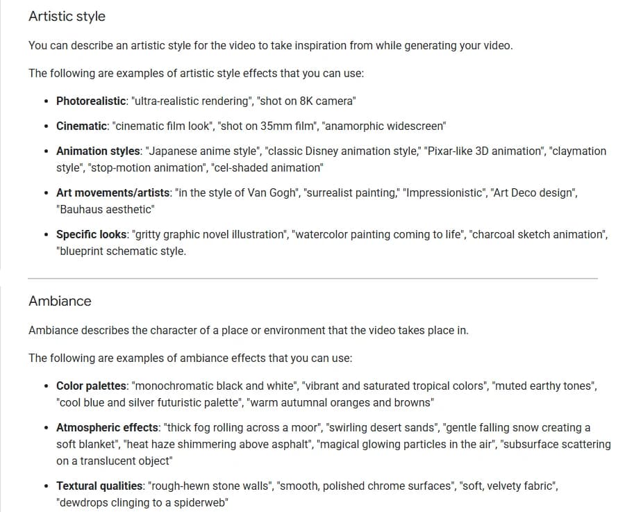
Artistic style and Ambiance sections of Google's video generation prompt guide for Veo, captured 10 October 2026. The two example videos between them have been cut out.
Notice where Google puts film noir. It isn't a color style in that guide. It sits under lighting, as "film noir style with deep shadows and stark highlights." That's the right instinct. Most film looks are light first and color second.
The four things a look is made of
Every film look, stock or grade, comes down to four properties you can write in plain words:
- Color balance. Where neutral sits. Warm, cool, green, magenta, or a split where skin goes one way and the world another.
- Contrast and black level. Crushed inky blacks, normal blacks, or lifted milky blacks that read as gray.
- Saturation. How much color survives, and where. Rich everywhere, drained everywhere, or rich only in skin and practical lights.
- Texture. Fine grain, coarse grain, clean digital, halation around highlights, soft vignette.
A stock name or a grade name is shorthand for a particular setting of those four. When the shorthand doesn't land, write the four out. Every demo prompt quoted below does.
The reference table
| Look | Color balance | Blacks and contrast | Write it like this | Common drift | First fix |
|---|---|---|---|---|---|
| Teal and orange | Skin and warm lights orange, shadows and background cyan | Normal to firm | "Warm amber ceiling strips light her face orange while the metal walls glow deep teal" | The whole frame goes teal, faces included | Name the warm source on the subject and the cool source behind |
| Bleach bypass | Desaturated toward steel and silver | High contrast, crushed blacks | "Crushed inky blacks, color pushed toward steel and silver, pale metallic skin, coarse grain" | Plain gray, low contrast | Ask for hard light and deep blacks as well as low saturation |
| Film noir (black and white) | No color | Hard, low-key, deep black | "Black and white, a single hard light from off-frame left, the background falling into near-total black" | Color footage with a dark mood | Write "black and white" first and give one hard source |
| Faded film | Warm yellow-pink cast in highlights | Lifted, milky blacks, flat | "Lifted milky blacks so shadows read pale gray, contrast flattened, muted color" | Simply underexposed | Say the shadows are gray, not dark |
| Cross processing | Yellow-green highlights, cyan and magenta shadows | Pushed hard, crushed blacks | "Highlights blow out yellow-green, shadows shift toward cyan and magenta, skin slightly jaundiced" | A normal warm filter | Describe what happens to skin and to the shadows |
| Warm amber | Gold and honey | Soft | "Tungsten lamps and an open oven pour orange light over the counter, skin glowing gold" | Orange tint over everything | Put the warm source in frame |
| Cool blue | Blue and silver | Normal | "Cool blue and silver palette, daylight from a north window, skin pale" | Blue cast that kills the faces | Keep one neutral or warm element in the frame |
| Tungsten stock at night (500T) | Neutral under warm lamps, blue where daylight or neon leaks in | Clean shadows, fine grain | "Night street lit by tungsten lamps, a blue cast where the shop windows leak in, fine grain in the shadows" | Generic "cinematic night" | Describe the mixed light rather than naming the stock |
| Sepia | Brown monochrome | Soft | "Sepia toned, film grain, 1920s street" (Google's own example) | Sepia filter over modern detail | Add period costume and setting so the look has a reason |
The middle column is adapted from the prompts behind our film techniques color library, which renders a demo clip for fifteen color and film looks and publishes the exact prompt under each one. The sepia line is Google's.
Teal and orange: build it from two light sources
Teal and orange is where a bare label goes wrong most visibly. Ask for "teal and orange color grade" and nothing else, and you risk the model tinting the whole frame. Faces go cyan, and the separation that makes the look work disappears.
The fix is in how a cinematographer gets it on a real set. Our teal and orange page says it in its shot note: build the split on set with warm practicals or tungsten on faces and cool ambient light in the background, then let the colorist push it. A prompt can do the same thing. Name a warm source that hits the subject and a cool source that fills the world behind.
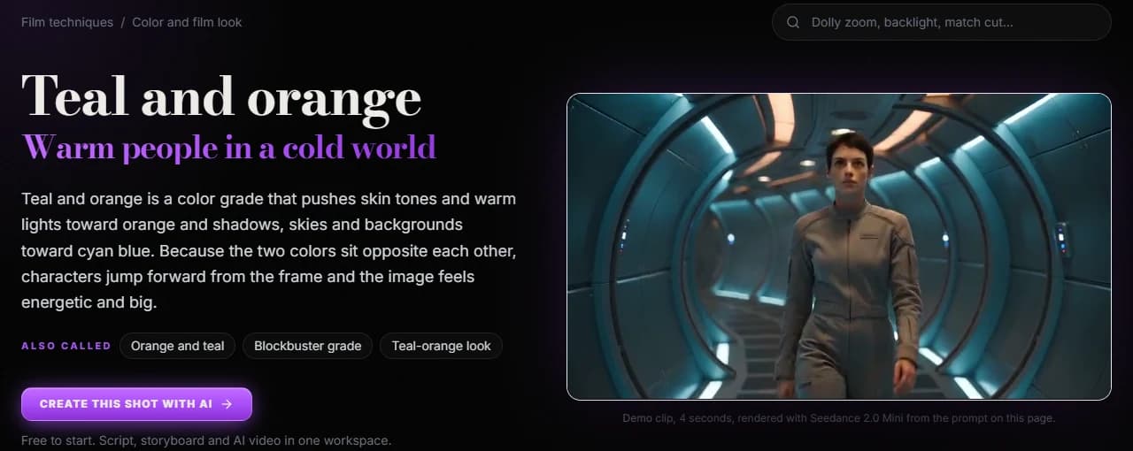
The teal and orange page of ScreenWeaver's film techniques library, captured 10 October 2026. The clip is a 4-second render from Seedance 2.0 Mini.
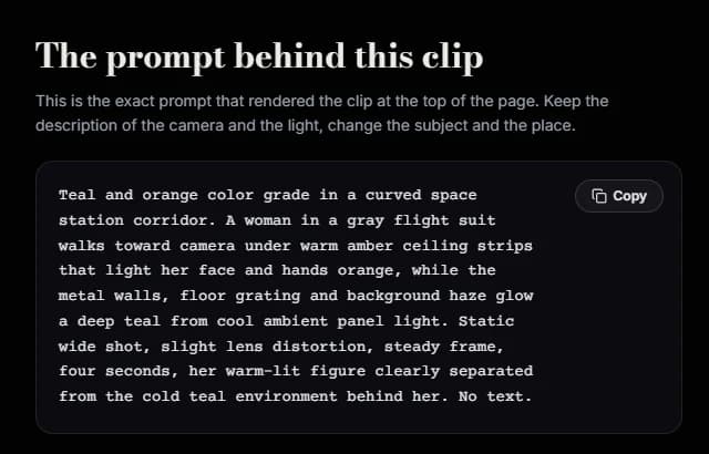
The "prompt behind this clip" block on the same page, captured 10 October 2026.
Read that prompt again and count what it spends on the grade name: five words at the start. The rest says which surfaces are warm (her face and hands), why (amber ceiling strips), which surfaces are cold (walls, grating, haze), why (cool panel light), and what the result should do ("her warm-lit figure clearly separated from the cold teal environment"). That last clause is the one we'd never cut. It tells the model what the look is for.
Bleach bypass and the drained looks
Bleach bypass comes from a lab process that skips the bleach step and leaves silver in the image, laying a black and white layer over the color. The result is hard contrast and drained color. The usual failure in a prompt is getting only half of it: low saturation without the contrast, which reads as flat gray footage.
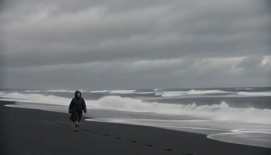
Our bleach bypass demo asks for both halves in the same sentence: "high contrast with crushed, inky blacks, desaturated color pushed toward steel and silver, pale metallic skin tones, and coarse visible film grain." It also sets "overcast hard light" on a black sand beach, which gives the look dark surfaces and gray sky to work on. A drained look on a pastel bakery would fight the scene.
The same logic covers "desaturated" and "muted earthy tones." Say where the color is leaving from. "Muted color, but the red of her scarf still reads" gives you a much more deliberate frame than "desaturated."
Noir and black and white: it's the light
If you want noir, write the lighting and write "black and white" early. "Film noir style" alone can give you a moody color image with some shadows. Our film noir demo leads with the light: "a single hard spotlight cuts through the fog from off-frame left, throwing sharp tree-branch shadows across the ground and the figure's face," then states "the image is black and white, high-contrast, with the background falling into near-total black."
For straight black and white without the noir mood, our black and white page adds a phrase that removes doubt: "No color exists anywhere in the frame, only pure grayscale tones from white paper to black wood." Naming the brightest and darkest things in the scene also gives the model a tonal range to hit.
One practical note from that page's shot advice: two different colors can become the same gray. In a prompt, separate your subject from the background by brightness, not by color. "Pale face against dark wood shelves" survives the conversion. "Red coat against a green wall" may not.
Try it free
Try Screenweaver for free on your script
It is free. Import your existing project, get a clearer view of your outline, and regain control of your story structure in minutes.
Start FreeFaded film and cross processing: describe the damage
These looks are about something going wrong with the film, so describe what went wrong.
For a faded print, the key word is lifted. Our faded film demo writes "lifted, milky blacks so shadows read pale gray instead of true black, contrast flattened, colors muted with an uneven warm yellow-pink cast creeping across the highlights." Without the black level, "faded" can come back as merely dark or merely soft.
Cross processing works the same way. Its prompt describes the color shift in each part of the image: highlights "blow out into a sickly yellow-green," shadows "shift toward cyan and magenta," skin looks "slightly jaundiced." The word "jaundiced" does a lot of work. When the skin is described, you know the look will touch the people, not just the sky.
Kodak and other stock names
Stock names are the hardest case, because they mean something precise to a cinematographer and something fuzzy to a model.
Take Kodak VISION3 500T. The "T" means tungsten-balanced: the stock renders tungsten light as neutral, and Kodak's own product page suggests an 85 filter for daylight use. That's why 500T footage at night has its familiar character: warm lamps look natural, while daylight and some neon leaking into the frame go blue. Kodak's page also stresses reduced grain in the shadows.
A model has seen the label "500T" under some of that footage, but there's no guarantee it ties the label to those properties. The more reliable move is to write the properties out: "night street lit by tungsten lamps that read neutral, a blue cast where the cold shop windows spill onto the pavement, fine grain in the shadows." If you like the label, keep it at the end as a style hint. Just don't let it carry the whole look.
The same goes for any brand. A still photography stock name may pull toward a still photography look, which is not always what a moving shot needs. And mixing two stock names in one prompt gives the model two averages to blend. Pick one, then describe it.
There's also the ambiguity from our lens prompts guide: "35mm" can be read as a focal length or as a film gauge. Write "shot on 35mm film" for the look and "35mm lens" for the glass, never the bare number.
When to grade in the edit instead
Generating the look into every clip has a cost. Each generation interprets "teal and orange" a little differently, so shot four may come back greener than shot three, and a scene cut together from both will jump.
For a single hero shot or a stylized short, prompt the look fully and accept some variation. For a scene or a series where many clips must match, generate a gentler version of the look, with the light sources and palette described but the extremes held back, then finish the grade in your editor with one correction applied to every clip. A neutral-ish source survives a grade far better than a heavily pushed one, especially when blacks have already been crushed.
Whichever you choose, keep the look wording identical across every shot in a scene. Copy the whole look sentence. Changing "deep teal" to "cool blue" between two shots is enough to make them read as different places. The same discipline applies to faces, which character drift covers in detail.
A prompt pattern for film looks
The order we use, at the end of the prompt:
[the light sources that motivate the look], [color balance and where it lands], [blacks and contrast], [saturation], [texture].
Optionally finish with the look's name as a hint.
Before: Cinematic shot of a detective in a diner at night, Kodak film, teal and orange, moody grade, film grain, 4K.
After: A detective alone in a diner booth at night, a tungsten pendant lamp warming his face and hands, the window behind him filled with cold blue street light, shadows deep but not crushed, color rich only in his skin and the red vinyl seat, fine film grain. Teal and orange.
The first prompt names a brand, a grade, a mood and a resolution, and describes none of them. The second places a warm source on the subject and a cool one behind him, sets the black level, says where color survives and asks for a specific grain. The label at the end is now redundant, which is the point.
Checklist before you generate
- The look has at least one light source in the scene that could produce it
- Color balance is described, including where skin lands
- Black level is stated (crushed, normal or lifted)
- Saturation says where color survives, not just how much
- Grain or texture is described in words, not left to "film look"
- Noir and black and white are written as light first, with "black and white" stated early
- "Shot on 35mm film" is used for the look, "35mm lens" for the focal length
- Only one stock name, if any, and its properties are written out
- Every shot in a scene uses the same look sentence, copied word for word
- For long sequences, the strongest part of the grade is left for the edit
Tools for this
The film techniques color library has fifteen color and film looks, each with a demo clip and the exact prompt that made it, and the genre looks section adds noir, neo-noir and giallo among others. The AI video prompt generator has a "35mm film look" preset in its lens and look field, plus "film noir" and "neo-noir" styles, and builds the rest of the prompt around them. If you're starting from a screenplay, ScreenWeaver breaks each scene into shots and writes a prompt for each, with the scene's light and palette carried from shot to shot; the AI film guide walks through it.
FAQ
Can I use Kodak film stock names in AI video prompts? You can, but treat them as hints. A model has no film chemistry; it has seen the label under some footage. Write out what the stock does (color balance, grain, how it handles the light in your scene) and add the name at the end if you want.
How do I get a teal and orange look without blue faces? Name a warm light source that falls on the subject and a cool one that fills the background, then say the warm figure stands out from the cold surroundings. A bare "teal and orange grade" can tint the whole frame, faces included.
Why does my film noir prompt come out in color? "Film noir" reads as a mood as much as a color choice. Write "black and white" early in the prompt, describe one hard light source and say the background falls into black. Google's Veo guide files noir under lighting for good reason.
What does "shot on 35mm film" do in a prompt? Google's Veo guide lists it as a cinematic style keyword, so expect some version of a film look, usually grain and warmer, softer color than clean digital. It doesn't set a focal length. Write "35mm lens" for that.
Should I grade in the prompt or in post? For a single stylized shot, prompt it. For a scene where many clips must cut together, prompt a gentler version with the same light and palette in every shot, then apply the strong grade once in the edit so every clip gets the identical correction.
Should a screenplay mention the color grade? No. Write the sources of color in the world (a sodium lamp, a fire, a blue night outside a window) and leave the grade to the look book. If you direct your own AI film, the look goes in the shot list and in each prompt.
Final Step
Build your next script with Screenweaver
Move from ideas to production-ready pages faster with timeline-native writing and AI-assisted story flow.
Try Screenweaver