Dystopian lookA world built to crush people
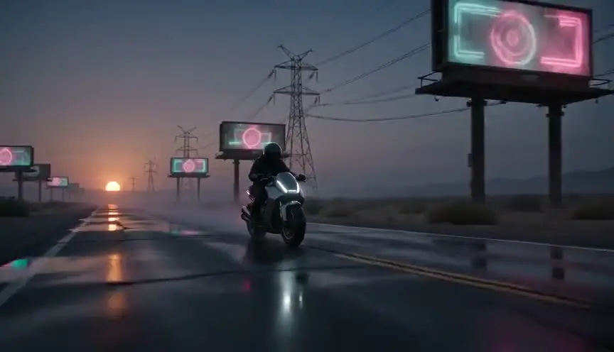
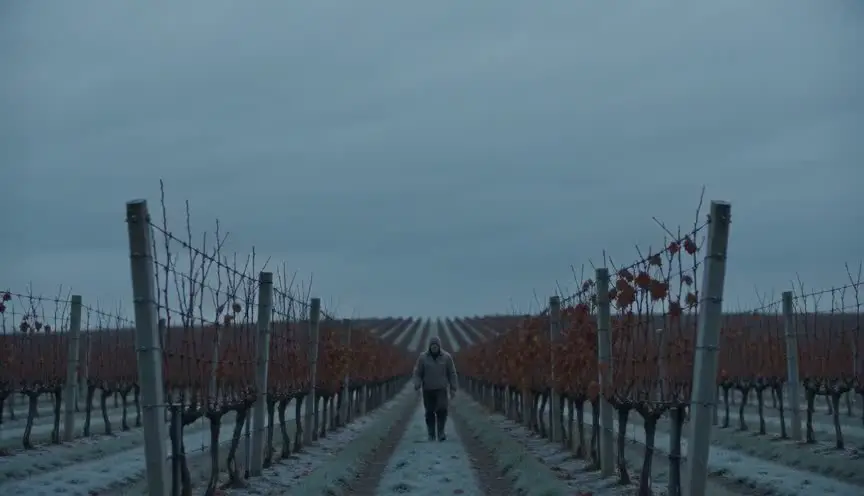
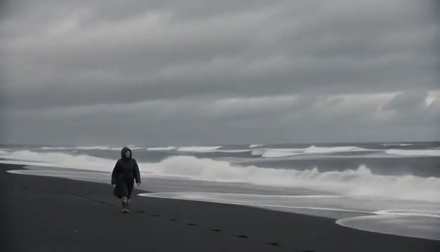
The dystopian look shows an oppressive society through cold or bleached palettes, crushing architecture, surveillance, clutter or emptiness, and signs of decay. The audience feels the weight of a system that controls and diminishes its people.
Also calledDystopic lookOppressive future lookAuthoritarian grade
Genre looks
Why it works on screen
Dystopian stories follow individuals inside a broken order: a clerk who starts to doubt, a mother who hides a child, a worker who remembers the past. The look serves fear, resistance, conformity, exhaustion and fragile hope. Every visual choice should say something about control: who watches, who waits in line, who has space and who does not. A story earns this style when its conflict is between a person and a system, and when the world's rules are part of the drama. The audience should feel the pressure in every frame, then feel the smallest act of freedom like a breath.
The shot list line
- Size
- Wide shots showing people small in architecture, close on documents and faces
- Angle
- High angles to diminish, frontal and symmetrical for power
- Movement
- Static or slow, controlled moves
- Lens
- Wide for crushing spaces, long lens for surveillance views
- Duration
- 4 to 10 s
Desaturate or cool the palette, keep geometry rigid, and show surveillance or control in the frame.
Screenplay
On the page
Show the system through details and procedures. Write the queue, the form, the checkpoint, the propaganda poster, the rationed item. Let rules affect behavior: characters whisper, avoid eyes, perform loyalty. One strong detail per scene is better than paragraphs of world-building. Leave palette, lenses and architecture scale to the director and the designer. They will turn your rules into images in the shot list.
INT. DISTRICT 4 RATION OFFICE - MORNING
A line of people along a wall painted the color of weak tea. Nobody talks.
HALINA VOSK (50s, clerk, badge number stitched on her sleeve) stamps cards without looking up.
A boy, EMIL (10), slides a card across. The photo is of an old man.
Halina looks at the photo. At the boy. At the camera dome above them.
She stamps it.
HALINA
Next.
Storyboard
In the storyboard
Draw rigid, repetitive architecture: corridors, rows of desks, walls of screens, lines of people. Place characters small and aligned. Use high angles and symmetrical frames. Add surveillance icons (cameras, screens, guards). Label the palette (gray, cold blue, bleached) and one warm accent if the story needs hope. Note the rule of the world shown in each panel.
Pairs well with

High angles shrink characters under the weight of the system. They make the audience feel the view from above, the view of power watching.
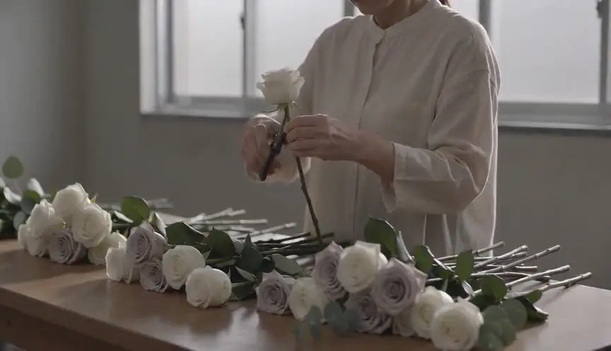
Draining color expresses a world without joy or choice. A single returning color later can mark hope or rebellion with great force.
Reference
Watch it in
Children of Men (2006)
A washed-out, handheld, documentary-like grade and crowded frames make near-future Britain feel worn out and falling apart.
Blade Runner 2049 (2017)
A pale, cold palette and huge, empty interiors show a society under control where people are isolated from each other.
Brazil (1985)
Frames stuffed with clutter, wide lenses and industrial machines make bureaucracy itself feel like a jail.
ScreenWeaver
Set it up in ScreenWeaver
Write the rules of your world through details and procedures, and ScreenWeaver breaks the scene down into shots automatically. Open each shot and set wide or close framings, high or frontal angles, static or controlled movements and durations. Note the palette and signs of control in the shot descriptions. Characters, locations and references carry from shot to shot, so uniforms, spaces and colors stay consistent, and the AI previsualization lets you judge the oppression before designing it.
Start writing for freeThe prompt behind this clip
This is the exact prompt that rendered the clip at the top of the page. Keep the description of the camera and the light, change the subject and the place.
Dystopian look: a static wide shot on an 18mm lens inside a cramped, steam-filled ramen kitchen where exhausted cooks in identical gray uniforms work under a single flickering overhead fluorescent tube. The color grade is pushed toward cold olive and steel, skin looking pale and sickly, shadows dense in the corners where exposed pipes and cracked tile show decay. Steam drifts constantly across the frame, a numbered badge hangs from each cook's collar, and no one looks up from the counter as the camera holds perfectly still for the full four seconds. No text.
Common mistakes
- 01
World without rules
Gray palettes and ruins are not enough. The audience needs to understand how the system controls people. Show its rules in action.
- 02
Monotony
An entire film in the same cold gray tires the eye. Build contrast with small warm spaces, memories or acts of rebellion.
- 03
Generic future
Copying famous dystopias makes the world feel second-hand. Ground it in a specific culture, economy and history.