Tonal contrastLight against dark, meaning in between
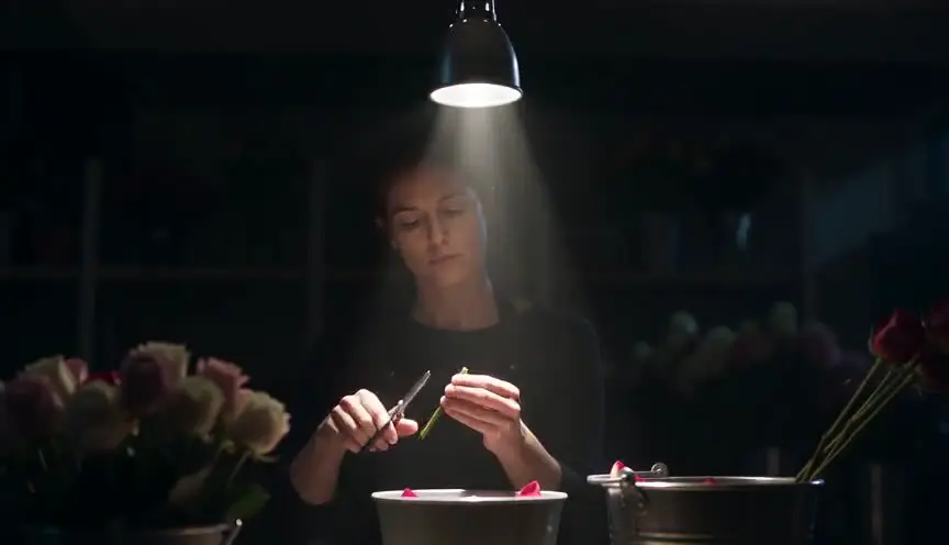
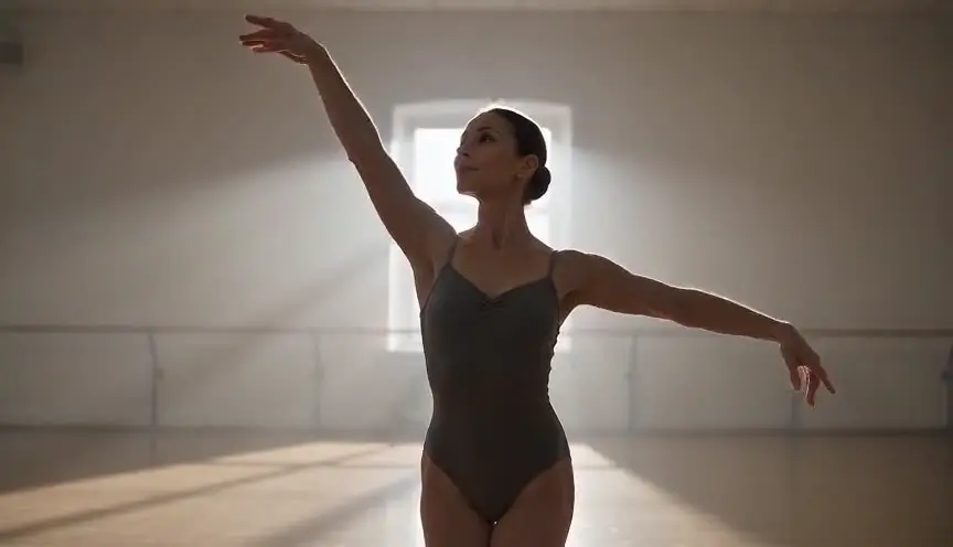
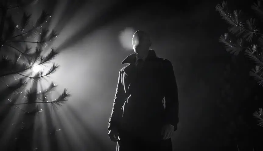
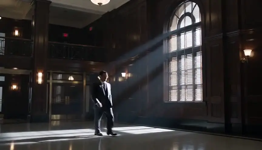
Tonal contrast is the difference in brightness between parts of the frame, from deep black to bright white. Strong contrast carves shapes out of darkness and feels dramatic, while low contrast feels soft, foggy or melancholic.
Also calledValue contrastLight-dark contrastBrightness contrast
Composition
Why it works on screen
Contrast is one of the fastest ways to set a moral and emotional temperature. A face emerging from black suggests secrets, danger or revelation. A bright figure in a dark mine suggests a small hope in a hostile place. Low contrast, grey on grey, suits grief, fatigue and fog of memory. Use strong tonal contrast for crime, horror, noir, power and confession. A scene earns it when the story is about what is hidden and what comes into view, or when a single source of light defines the whole world of the scene.
The shot list line
- Size
- Medium close-up
- Angle
- Eye level
- Movement
- Static or handheld
- Lens
- 35mm to 50mm, fast aperture
- Duration
- 3 to 6 s
Expose for the brightest element you care about and let the rest fall to black; do not fill the shadows unless the story needs detail there.
Screenplay
On the page
You can write contrast through light sources, not through exposure terms. A single headlamp in a tunnel, a doorway blazing white in a dark barn, a face lit only by a phone. Name the source and what it leaves in darkness. That tells the director the scene is high contrast. Avoid words like "crushed blacks" or "ratio." Specific ratios, fixtures and grading notes belong in the shot list and the lighting plan.
INT. COAL MINE - COALFACE - NIGHT SHIFT
Total darkness except for the beams of headlamps cutting through dust.
GARETH PRICE (50s) and his apprentice RHYS (18) crouch at the seam, their faces only visible when they turn toward each other.
A crack runs through the roof above them. Gareth's lamp finds it. Holds.
GARETH
Back. Slowly.
Rhys's lamp swings wildly as he scrambles. Then only one beam is steady.
Storyboard
In the storyboard
Work in two or three tones only: solid black, a mid grey and white. Fill most of the panel black and leave the lit shapes white, with hard edges where the light cuts. Mark each light source with a small arrow or lamp symbol. Add a note with the target contrast, such as deep blacks, no fill. If light moves during the shot, draw a second panel showing the new pattern of light and dark.
Pairs well with
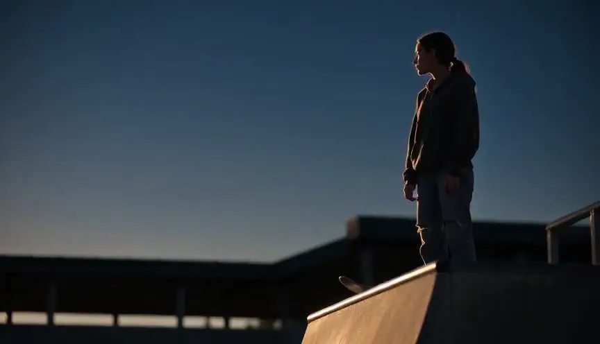
Low-key lighting is the tool that creates strong tonal contrast. Plan them together, so the lighting setup and the composition of bright and dark shapes serve the same idea.
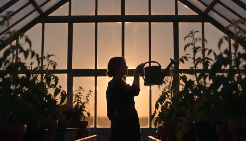
Push tonal contrast to its limit and a character becomes a silhouette. Cut from a face half lit to a pure silhouette when they turn into a threat or a symbol.
Reference
Watch it in
The Godfather (1972)
Gordon Willis lets interiors sink into shadow, so faces rise from near black and the rooms seem full of secrets and power.
Sin City (2005)
Almost the whole film is pure black and pure white, with bodies and objects cut out in bright shapes against darkness.
There Will Be Blood (2007)
Robert Elswit shoots the oil camp at night as fire and lamps against total darkness, which cuts Plainview off from the black around him.
ScreenWeaver
Set it up in ScreenWeaver
Name the single light source and what stays dark in your action lines, and ScreenWeaver breaks the scene down into shots automatically. Open the shot, set a medium close-up at eye level, static or handheld, with a duration that fits the beat. Note the contrast on the shot. The characters and the location carry from shot to shot, so the light logic stays consistent, and the AI previsualization lets you judge the mood of bright against dark before the shoot.
Start writing for freeThe prompt behind this clip
This is the exact prompt that rendered the clip at the top of the page. Keep the description of the camera and the light, change the subject and the place.
Tonal contrast: a static locked-off medium shot inside a dim car repair garage, most of the frame swallowed in deep black shadow except a single overhead work lamp that throws a hard cone of bright light onto a mechanic in a pale gray jumpsuit crouched beside an open engine bay. The mechanic's skin and clothing read almost white against the surrounding blackness, while tools and tires in the background stay barely visible silhouettes. The camera holds perfectly still for the full four seconds, the light source and exposure fixed, so the eye is pulled straight to the bright figure against the dark garage. No text.
Common mistakes
- 01
Black that hides the story
Deep shadows are powerful, but if the audience cannot read an important face or action, contrast becomes confusion. Keep a sliver of light on what matters.
- 02
Contrast with no source
Strong light and dark shapes that no lamp or window explains feel artificial. Establish the source in the scene, even briefly.
- 03
Grading it flat
High contrast on set can be lost in a timid grade or a streaming compression. Protect blacks and highlights in the grading notes and check on several screens.