Figure-groundOne shape the eye cannot miss
Figure-ground is the relationship between the subject, the figure, and everything behind it, the ground. When the two contrast clearly in tone, color, focus or texture, the audience finds the subject instantly, even in a crowded or chaotic frame.
Also calledFigure-ground relationshipSubject-background separationFigure-ground contrast
Composition
Why it works on screen
Clear separation is how a film tells the audience who matters in a storm of images. A lifeguard in orange against a grey sea, a dancer lit white on a dark stage, a child in a bright coat in a colorless crowd. Use strong figure-ground when a character must stand out from chaos, when one person is marked by fate, or when you want the audience to track someone through a busy space. Weak separation has its own story: a character who blends into the background is hiding, forgotten or absorbed by their world.
The shot list line
- Size
- Wide shot
- Angle
- Eye level
- Movement
- Static or pan following the figure
- Lens
- 50mm to 100mm
- Duration
- 3 to 6 s
Separate the subject from the background by at least one strong contrast (tone, saturation or focus) and keep the background low in detail.
Screenplay
On the page
Writers shape figure-ground through what they notice. Describe the background in a phrase, then give the character one distinctive trait that separates them: a color, a light on them, a stillness when everything moves. Do not overload costume details; one strong contrast is enough. If a character should vanish into a crowd, write that too. Exposure, color palette and focus are for the director and the shot list.
EXT. SURF BEACH - GOLD COAST - STORM DAY
Grey sea, grey sky, grey sand blown sideways.
On the lifeguard tower, TAMSIN HOLLOWAY (23, orange rescue shirt) stands with binoculars, the only bright thing on the beach.
Far out, a head bobs between waves, then vanishes.
Tamsin drops the binoculars and runs, a streak of orange down the sand.
TAMSIN
(into radio)
Swimmer down. Going in.
Storyboard
In the storyboard
Fill the background with light, even hatching or a single flat tone. Draw the figure with a hard outline and leave it blank or solid dark, the opposite of the background. Mark its color with a note if color is the contrast. Add a small arrow if the figure moves across the frame, and label the separation method, for example orange against grey, or sharp against soft. Note the lens and the duration under the panel.
Pairs well with

A shallow depth of field turns the background into soft shapes, so the figure stands out even when tone and color are similar. Use it in busy, real locations.
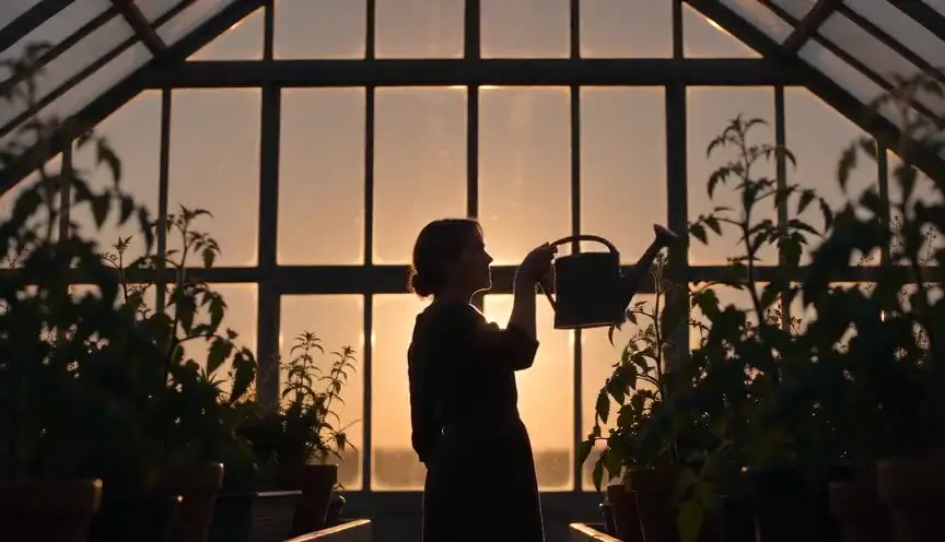
A silhouette is figure-ground pushed to its limit: a black shape against a bright ground. Move to it when the character should become a symbol rather than a face.
Reference
Watch it in
The Red Shoes (1948)
In the ballet, lit dancers move before dark painted sets, so each figure stands out with the clarity of a stage performance.
Schindler's List (1993)
A little girl's red coat is the only color in the black and white ghetto, so the eye finds her at once amid the chaos.
ScreenWeaver
Set it up in ScreenWeaver
Give the character one distinctive trait in your action lines, and ScreenWeaver breaks the scene down into shots automatically. Open the shot, set a wide framing at eye level, static or panning with the figure, and a duration that fits the pace. Add a costume or color reference to the character so it carries from shot to shot, along with the location. The AI previsualization shows whether the figure separates clearly from the background before the shoot.
Start writing for freeThe prompt behind this clip
This is the exact prompt that rendered the clip at the top of the page. Keep the description of the camera and the light, change the subject and the place.
Figure-ground composition in a ballet rehearsal room, a mature female dancer in a charcoal leotard standing center frame, lit by a single side window so her body is a crisp, high-contrast silhouette against the pale, evenly lit wall behind her. Shot on an 85mm lens at f/2, camera locked on a tripod, completely static. The dancer slowly raises one arm in a controlled port de bras, her sharp outline never merging with the flat, soft background, dust drifting faintly in the light beam. No text.
Common mistakes
- 01
Background as busy as the subject
A patterned wall behind a patterned costume makes the character vanish. Simplify one of the two, or separate them with focus or light.
- 02
Too many standout elements
If extras, props and signs all pop, the eye jumps around. Keep strong contrast for the figure and mute everything else.
- 03
Losing separation in the grade
A flat grade can erase contrast that was clear on set. Protect the figure's color and tone in the grading notes.